I build my own tools inside Photoshop for product and advertising work. This one I got wrong more than once, and the ways it was wrong are the useful part.
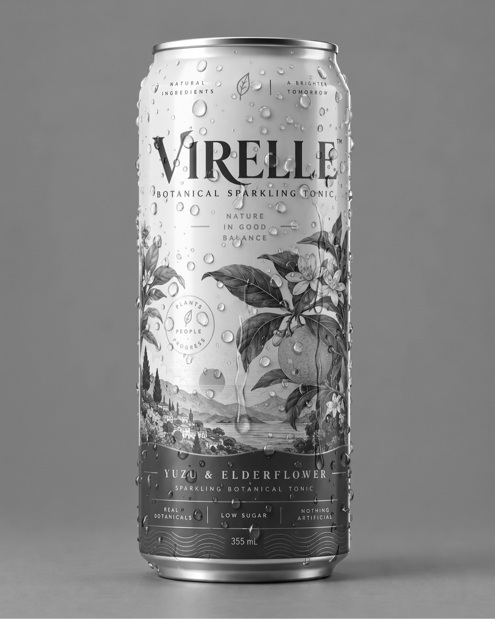
Effects go last. You retouch the product, fix the label, get it approved — and only then does someone ask for condensation, frost or steam. So whatever adds the effect has to sit on top of signed-off work without changing a single pixel of it.
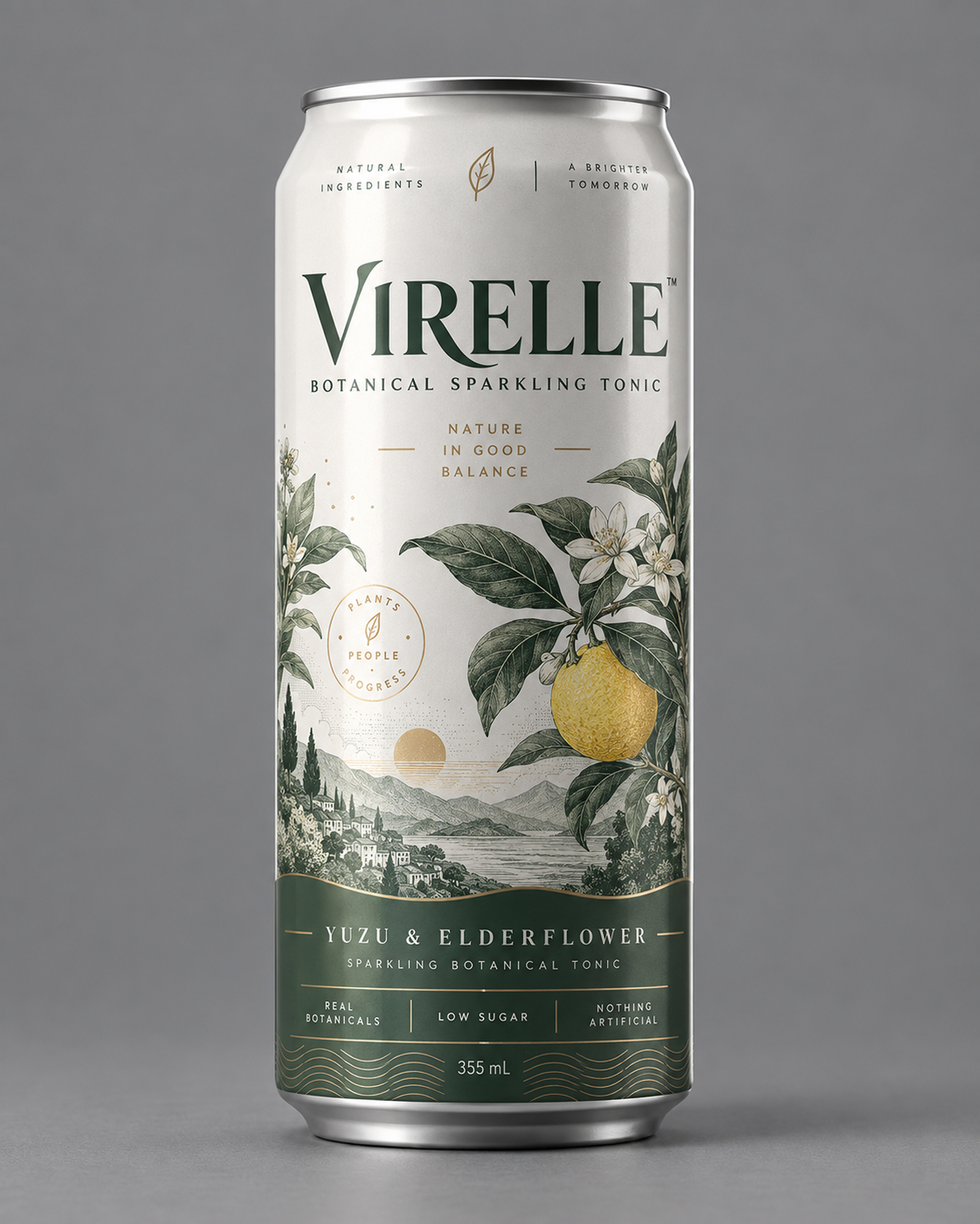
Why you can’t just generate it
Hand the finished shot to a generative model and ask for condensation, and you’ll get condensation on a slightly different can. These models don’t edit, they regenerate. On packaging that lands exactly where it hurts: the artwork gets repainted. Letterforms shift, kerning moves, a rule changes weight, a logo loses a detail.
Brand identity has an exact artwork, supplied by the agency. Redrawing it even slightly isn’t a worse version. It’s a version you can’t deliver.
First attempt: keep only what changed
Generate the effect on the real image, compare it pixel by pixel against the original, and keep only what changed. Large differences would be droplets; small ones would be drift. A threshold separates them, and the effect lands on its own layer over the untouched retouch.
It looked right and it was wrong. A threshold sorts by size of change, not by kind. When a model redraws a letter, the change happens on a hard, high-contrast edge — as large as a droplet, often larger. In practice it showed up as soon as I zoomed in: slightly redrawn letters sitting on top of the approved layer. No threshold fixes that, because there’s no value at which droplets and redrawn type separate.


Second attempt: paint the effect on grey
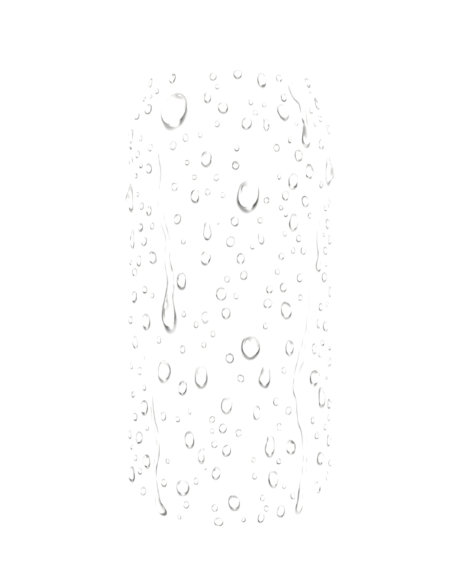
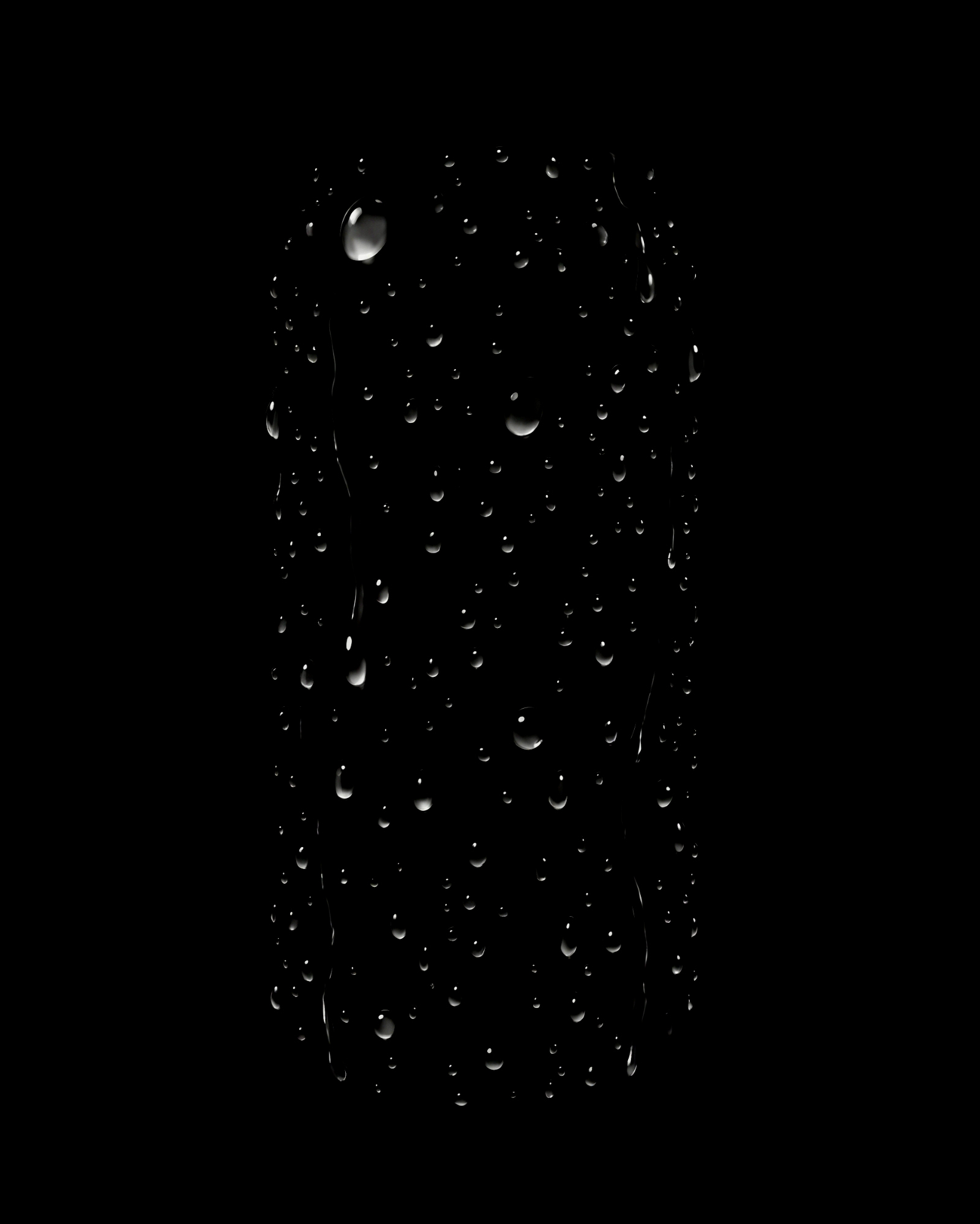
The model still needs to see the can — it has to know where the surface curves and which way the light falls to place each droplet convincingly. But it doesn’t need to paint the can. So I ask for the opposite of what you’d normally ask: use the product to position the effect, then return only the effect, on flat 50% grey. Droplets lighter where the highlights are, darker where the shadows are, grey everywhere else.
Anyone who has built a dodge-and-burn layer will recognise what happens next. The grey plate is split in two:
- Everything lighter than grey goes to a layer in Screen. In Screen, black does nothing — so the neutral areas vanish and only the highlights remain.
- Everything darker than grey goes to a layer in Multiply. In Multiply, white does nothing — so only the shadows remain.
A narrow dead zone around the neutral absorbs the noise the model leaves behind. Where there’s no effect, both layers are mathematically neutral. The approved retouch underneath isn’t protected by a mask. It simply can’t change.
One detail I got wrong along the way: my first version used a single grey layer in Linear Light, which is how most people would do it. It leaks — it lets drift through and doubles the ghost of whatever the model painted. Only blends that cancel out exactly at the neutral point isolate cleanly. That’s why the plate is split in two rather than used as one layer.
Where the problem went
This is the part I didn’t expect. Splitting on grey guarantees the approved image underneath can’t change. It doesn’t guarantee what the model paints on the grey. The problem didn’t disappear — it moved from the mask to the plate.
And the model doesn’t always cooperate. Three things I ran into:
It sometimes ignored the grey entirely and returned the whole can with droplets on it. The cause was my own instructions: the effect prompts said “change nothing else”, which is exactly right on a real photo and exactly wrong here. Given two contradictory orders, it sometimes obeyed the wrong one. Stating the grey rule last, and explicitly overriding the other, fixed it.
Colourful artwork leaks through. Even on grey, the model is drawn to whatever is most saturated in the illustration — a piece of fruit, a cluster of leaves — and reproduces a trace of it on the plate. That trace then lands on your can through the Screen and Multiply layers.
Density matters more than the effect. Condensation comes out clean: it’s a dense, even field that covers the whole surface, so there are no gaps to fill and every droplet inherits the curvature of the can. Scattered drops are much harder. The grey gaps between them are an invitation, and the model fills them with a faint version of the product.
So the honest summary is this: for dense effects — condensation, mist, frost — the method works and the result is as clean as it looks. For sparse effects it works most of the time and I still check the plate before trusting it.
What it costs
Painting on grey means the droplets don’t refract the label behind them. At normal viewing size nobody notices. For a hero drop that needs real refraction, I still work on the real image and check the mask by hand.
It also needs the higher-resolution model. The faster one returns around 1K, and scaled up onto a tall can the droplets go soft. Sharp condensation costs a little more per image, and it’s worth it.
The same grey plate turned out to be useful for anything between camera and scene — rain in front of the lens, mist on glass, falling snow, dust in the air — because none of those need to know what the product looks like.
This lives in a plugin I use daily, alongside the label warp and the type selection I’ve written up before.