I already told you that I build my own tools inside Photoshop for packaging work. This is the second thing I learned the hard way: how to cut out lettering when the type and the surface behind it are the same material.
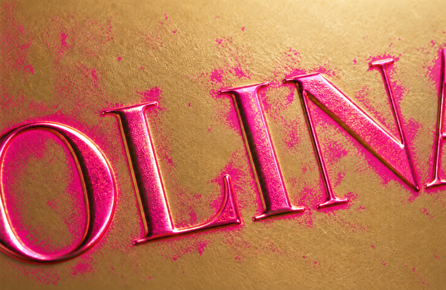
The job was straightforward on paper. Display lettering on a metallic surface had to be replaced. To replace it, you first have to select it — cleanly, with the bevels, the specular hits and the places where the letterforms are partly occluded.
Gold type on a gold surface has no colour boundary. That’s the whole problem, and it’s why every selection tool in Photoshop has a bad time with it.

Why Color Range can’t do it
Colour Range works on distance in colour space. It assumes the thing you want and the thing you don’t want occupy different regions. On a metallic surface they don’t: the highlight on the background is brighter than the shadow side of a letter, and the letter’s bevel picks up reflections from the surface it sits on. The overlap isn’t a tuning problem you can solve with a better tolerance value. It’s irreducible.
You can get 80% of the selection in ten seconds and then spend two hours on the last 20% with a brush. Anyone who has done this knows exactly which two hours I mean.
What didn’t work
Asking a generative model to paint the background flat. The idea: have the model repaint everything that isn’t type in pure magenta, then key the magenta. Three separate failure modes — it repainted the letters too, it changed the letterforms slightly while it was in there, and it flattened the lighting on the surface. The deeper lesson, which took me a while: “integrate it into the scene” and “give me a flat background” are contradictory instructions. You can’t ask for both in one pass. Either it’s two steps, or it’s a deterministic method.
Difference masking. Generate a version without the type, compare pixel by pixel, keep what changed. This works beautifully on some problems and fails here for two reasons: gold on gold produces almost no difference to detect, and the generative pass drifts globally — the whole image shifts slightly, so everything reads as changed.
Text detection with DBNet. If a general-purpose selection won’t work, detect the text first and constrain the selection to those boxes. Except standard document-oriented text detectors are trained on paragraphs. Display type, very large in frame, returns zero boxes — with tiling, with padding, with everything I tried. CRAFT does see it, which was useful, but it only gives you boxes. Running colour statistics inside versus outside the boxes still runs into the same irreducible overlap. My own verdict at that point was that it wasn’t better than selecting by hand.
What worked
A text segmentation model — SAM-TS, the text-specialised variant of Segment Anything — running locally, which returns a mask of the letterforms rather than a bounding box. First pass at standard resolution to find what is type. That gets the letters complete: bevels, speculars, partial occlusions, and no background.
Then two things that turned it from promising into usable:
A second pass at native resolution. The first pass works on a downscaled image, so the edge comes back soft when you scale it up. The fix is to re-run only on the area that already contains type, in tiles at full resolution, and let the second pass refine the edge the first one found. The global pass decides what; the fine pass only decides where the edge is. Keeping those two responsibilities separate matters — without it, the fine pass starts grabbing decorative elements the global pass had correctly ignored.
Edge treatment. A raw mask has hard pixel edges, which reads as a cut-out. Running a guided filter against the original image, with the radius scaled to the size of the glyph, puts the edge back on the actual letterform including its antialiasing.


What still doesn’t work
It isn’t perfect, and I’d rather say so. Very small type still needs to be enlarged before the fine pass to have enough pixels to work with. Heavily scripted or connected letterforms are harder than geometric ones. And the whole thing runs locally, which means it’s a piece of software on my machine rather than a button anyone can press.
What it did change is the economics. The two hours on the last 20% became a few minutes of checking. That’s the difference between a label change being a negotiation and a label change being a Tuesday.
This lives in a plugin I use daily, alongside the label-warp work I wrote up previously.